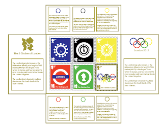
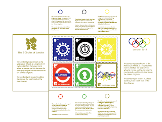
Instead of having each logo repeated, I replaced with simple blocks of gold text above and below each relevant stamp. On either side in the inside there is information about the history of the iconic Olympic logo and history about the 2012 logo.
After reviewing the sticker idea to connect it together, I felt I could take this a lot further, then I came up with the idea of a gold band. I need to consider different materials whether it will be ribbon, or a sticker or rope etc.., but the concept is to symbolise the end ribbon at the finishing line at the Olympics, so like the winner in a race runs through the ribbon and breaks it, portraying a similar idea when the customer is opening their limited edition stamps.
Below are a few final design ideas....


The front cover with the gold ribbon concept...

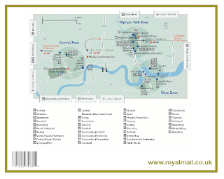
The back of the pack.....


No comments:
Post a Comment