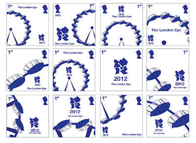
Here i started playing around with different scales and layouts of the the one stamp, and when i have decided on my final one, i will follow this through with the rest of them.

 I still kept with the white background but changed the colour of the queen, logo and definition to correspond with the iconic colour of each Olympic circle.
 Here i reversed the colours, seeing if it looked better adding a bit more dimension to the stamp. I think these work for other class stamps, but possibly for the 1st class set i should stick with the cold and 2nd class maybe try silver.


